In this tutorial, we are going to implement the Tab Component using Tailwind CSS and Alpine JS. Tutorial assumes that you have a basic understanding of both Tailwind CSS and JS and have them setup in a Project.
We are going to have 3 Tabs each with its unique content. We will first of all define the Tabs. We are going to use grid class. Since there are 3 tabs we will use grid-cols-3 class.
<div class="grid grid-cols-3 cursor-pointer font-bold">
    <div>First</div>
    <div>Second</div>
    <div>Third</div>
</div>
We have also used cursor-pointer class so that the cursor changes to pointer and font-bold class to make the Headings Bold. At this stage the Result looks like this.

Next we will apply classes to these Tabs to design them. We will add border, border-black, rounded-t-lg and px-4 classes to each of these div. The first 2 classes apply black border. rounded-t-lg makes sure that the upper left and upper right corners of the div are rounded. px-4 just applies some left and right padding. At this stage our HTML and output looks like below:
<div class="grid grid-cols-3 cursor-pointer font-bold">
    <div class="border border-black rounded-t-lg px-4">First</div>
    <div class="border border-black rounded-t-lg px-4">Second</div>
    <div class="border border-black rounded-t-lg px-4">Third</div>
</div>

Next we will apply white background and blue text to the first tab, which would be active by default. We will use bg-white and text-blue-700 classes for it. For inactive Tabs, we will use blue background and white text using the classes bg-blue-700 and text-white.
<div class="grid grid-cols-3 cursor-pointer font-bold">
    <div class="border border-black rounded-t-lg px-4 bg-white text-blue-700">First</div>
    <div class="border border-black rounded-t-lg px-4 bg-blue-700 text-white">Second</div>
    <div class="border border-black rounded-t-lg px-4 bg-blue-700 text-white">Third</div>
</div>

Before we continue further, lets also include AlpineJS. We will wrap the above HTML in a div.
<div x-data="tabs">
    ....
</div>
Here we have used x-data and specified tabs. So we will need define this function. This function will hold all the properties and methods related to Tabs Component.
function tabs() {
    return {
        active: 1,
    }
}
Here we have defined the property active which would define the active Tab and we have given it a default value of 1. We would also define a method which would tell us if the given Tab is active or not.
function tabs() {
    return {
        active: 1,
        isActive(tab) {
            return tab == this.active;
        },
    }
}
Next we will use this isActive Method and :class Alpine Directive to dynamically apply classes to our Tabs.
<div class="border border-black rounded-t-lg px-4"
    :class="isActive(1) ? 'bg-white text-blue-700': 'bg-blue-700 text-white'"
>First</div>
Overall HTML looks like below.
<div x-data="tabs">
    <div class="grid grid-cols-3 cursor-pointer font-bold">
        <div class="border border-black rounded-t-lg px-4"
            :class="isActive(1) ? 'bg-white text-blue-700': 'bg-blue-700 text-white'"
        >First</div>
        <div class="border border-black rounded-t-lg px-4"
            :class="isActive(2) ? 'bg-white text-blue-700': 'bg-blue-700 text-white'"
        >Second</div>
        <div class="border border-black rounded-t-lg px-4"
            :class="isActive(3) ? 'bg-white text-blue-700': 'bg-blue-700 text-white'"
        >Third</div>
    </div>
</div>
Next we will change the value of active property when User Clicks on it. We will define a setActive Method in JS.
    setActive(value) {
        this.active = value;
    }
We will call this method when User clicks on the Tab. We are going to use @click Alpine Directive.
<div class="border border-black rounded-t-lg px-4"
    :class="isActive(1) ? 'bg-white text-blue-700': 'bg-blue-700 text-white'"
    @click="setActive(1)"
>First</div>
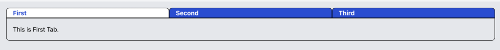
At this stage User should be able to change the Tab by clicking on it and the Active Tab Classes should change accordingly. Next we will define the Contents of the Tab.
<div class="border border-black p-4 rounded-b-lg">
    <div>
        This is First Tab.
    </div>
    <div>
        This is Second Tab.
    </div>
    <div>
        This is Tab Tab.
    </div>
</div>
Currently all Contents are showing. We can show / hide the contents based on the active tab. We will use the x-show directive and the same isActive Method.
<div x-show="isActive(1)">
    This is First Tab.
</div>
<div x-show="isActive(2)">
    This is Second Tab.
</div>
<div x-show="isActive(3)">
    This is Third Tab.
</div>
At this stage, our Tab Functionality will be working correctly. We can further improve UI this using the x-transition directive
<div x-show="isActive(1)" x-transition>
    This is First Tab.
</div>
You will see that this gives a bit of flickr effect. We can fix it by changing x-transition to x-transition:enter.duration.500ms
Our HTML at this stage looks like below:
<div x-data="tabs">
    <div class="grid grid-cols-3 cursor-pointer font-bold">
        <div class="border border-black rounded-t-lg px-4"
            :class="isActive(1) ? 'bg-white text-blue-700': 'bg-blue-700 text-white'"
            @click="setActive(1)"
        >First</div>
        <div class="border border-black rounded-t-lg px-4"
            :class="isActive(2) ? 'bg-white text-blue-700': 'bg-blue-700 text-white'"
            @click="setActive(2)"
        >Second</div>
        <div class="border border-black rounded-t-lg px-4"
            :class="isActive(3) ? 'bg-white text-blue-700': 'bg-blue-700 text-white'"
            @click="setActive(3)"
        >Third</div>
    </div>
    <div class="border border-black p-4 rounded-b-lg">
        <div x-show="isActive(1)" x-transition:enter.duration.500ms>
            This is First Tab.
        </div>
        <div x-show="isActive(2)" x-transition:enter.duration.500ms>
            This is Second Tab.
        </div>
        <div x-show="isActive(3)" x-transition:enter.duration.500ms>
            This is Third Tab.
        </div>
    </div>
</div>
We see a bit of duplicating classes for Active Tab. We can define a getClasses method as below:
getClasses(tab) {
    if(this.isActive(tab)) {
        return 'bg-white text-blue-700';
    }
    return 'bg-blue-700 text-white';
}
Our HTML now becomes
<div x-data="tabs">
    <div class="grid grid-cols-3 cursor-pointer font-bold">
        <div class="border border-black rounded-t-lg px-4" :class="getClasses(1)"
            @click="setActive(1)">First</div>
        <div class="border border-black rounded-t-lg px-4" :class="getClasses(2)"
            @click="setActive(2)">Second</div>
        <div class="border border-black rounded-t-lg px-4" :class="getClasses(2)"
            @click="setActive(3)">Third</div>
    </div>
    <div class="border border-black p-4 rounded-b-lg">
        <div x-show="isActive(1)" x-transition:enter.duration.500ms>
            This is First Tab.
        </div>
        <div x-show="isActive(2)" x-transition:enter.duration.500ms>
            This is Second Tab.
        </div>
        <div x-show="isActive(3)" x-transition:enter.duration.500ms>
            This is Third Tab.
        </div>
    </div>
</div>
And our Tab should be working fine like below:
Hope you have enjoyed this Tutorial.